Medical Content & Visual Communication Toolkit
Patient-friendly visual education for oncology clinical trial participation.
A clinical UX and medical communication case study showing how complex protocol content can be transformed into clear, visual materials that help patients understand, prepare, and ask better questions during an oncology trial.
Safety Symptom & “When to Call” Guide
Patient-Friendly Medical & Disease Education
Study Design Visual Explanation
Investigational Product or Intervention Mechanism-of-Action Visual Explanation
Medical Procedure Explanation Library
Educational portfolio concept based on a clinical trial protocol. Not official sponsor-approved patient material.
How this section is different from Protocol Experience Design
Clinical Trial Protocol Translation & Experience Design
Focus:
Operational UX, study burden, schedule complexity, eligibility, site workflow, and trial execution.
Examples:
- Protocol UX complexity audit
- Patient study journey map
- Visit burden visualization
- Site workflow & role-based execution map
- Schedule of Activities redesign
Medical Content & Visual Communication
Focus:
Patient-facing medical education, plain-language explanation, visual storytelling, safety communication, and procedure education.
Examples:
- Safety "When to Call" guide
- Disease education brochure
- Treatment arm visual explanation
- Mechanism-of-action diagram
- Medical procedure card library
Project Snapshot
A quick overview of the project, scope, and deliverables.
- Project
- Patient-friendly oncology clinical trial education toolkit based on a Phase 3 clinical protocol.
- Clinical Source Material
- Phase 3 clinical trial protocol for JAVELIN Bladder 100.View source protocol
- Focus Areas
- Protocol review, plain-language medical writing, patient education, visual communication, clinical UX, safety communication, oncology trial materials, and medical content strategy.
- Users
- Primarily patients considering or participating in an oncology clinical trial. Secondary users include study nurses, site staff, clinical educators, and medical/scientific stakeholders for selected materials.
- My Role
- Clinical UX Designer and Medical Content Strategist.
- Deliverables
- Safety “When to Call” guide, disease education brochure, treatment arms / study design visual, mechanism-of-action visual explanation with both patient-friendly and scientific expert versions, and modular procedure cards.
- Tools Used
- Figma, Canva, BioRender
Overview
This project explores how complex oncology clinical trial information can be transformed into clear, patient-friendly education materials without losing medical accuracy. Using a Phase 3 clinical trial protocol as the source material, I developed a visual communication toolkit to help patients understand the study purpose, treatment options, safety information, required procedures, and follow-up expectations.
The toolkit was designed for real-world clinical use across brochures, patient portals, clinic handouts, and study team conversations. Most materials were created primarily for patients, with one dual-audience deliverable—the mechanism-of-action visual explanation—developed in both a patient-friendly version and a more scientific expert version.
The goal was to make oncology trial participation easier to understand, easier to discuss, and less overwhelming while supporting accurate communication between patients and the study team.
The project was based on a Phase 3 oncology clinical trial protocol for JAVELIN Bladder 100, evaluating avelumab plus best supportive care versus best supportive care alone as maintenance treatment in patients with locally advanced or metastatic urothelial cancer whose disease did not progress after first-line platinum-containing chemotherapy. The protocol served as the source document for identifying patient-relevant content, simplifying complex medical language, and designing visual education materials.
View source protocol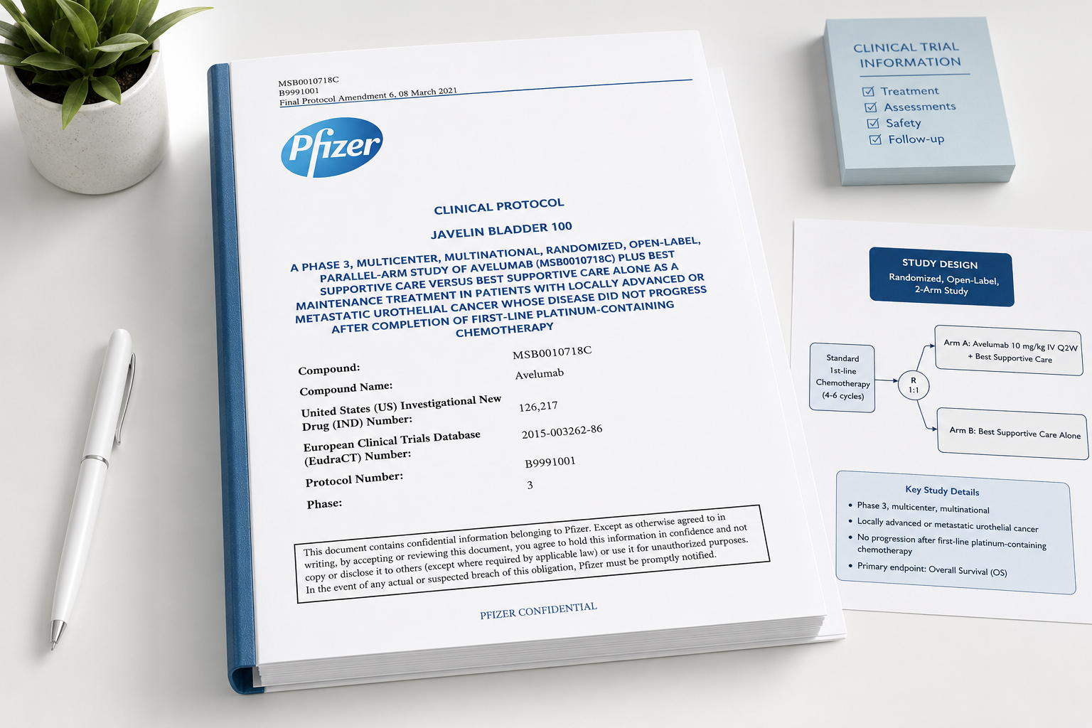
The Challenge:
Turning Complex Clinical Trial Information Into Clear Patient Guidance

Oncology clinical trial information is often medically complex and difficult for patients to absorb. Patients need to understand what treatment they may receive, what procedures may happen, what symptoms to report, how the treatment works, and why the study matters. The goal was to create visual tools that reduce uncertainty and support informed conversations with the study team.
Process
Design Approach
How complex oncology clinical trial information was translated into patient-friendly visual tools while preserving medical accuracy.
- 1
Identify patient-relevant medical content
Prioritize information patients need to understand treatment, procedures, safety, disease context, and follow-up.
- 2
Translate without losing medical accuracy
Rewrite technical protocol language into clear, patient-centered explanations while preserving clinical meaning.
- 3
Structure around patient questions
Organize content around questions patients are likely to ask: "What is it?", "Why is it needed?", "How do I prepare?", and "What happens afterward?"
- 4
Visualize complex concepts
Use diagrams, color coding, icons, cards, timelines, and illustrations to make abstract medical concepts easier to understand.
- 5
Adapt for real-world clinical use
Design materials that can support brochures, patient portals, study apps, clinic handouts, and nurse-led conversations.
Toolkit Deliverables
To support patient understanding across different touchpoints, I designed a modular set of patient-facing medical communication materials. Each component translated protocol-level information into a format that could be used in brochures, clinic handouts, patient portals, study apps, and nurse-led conversations.
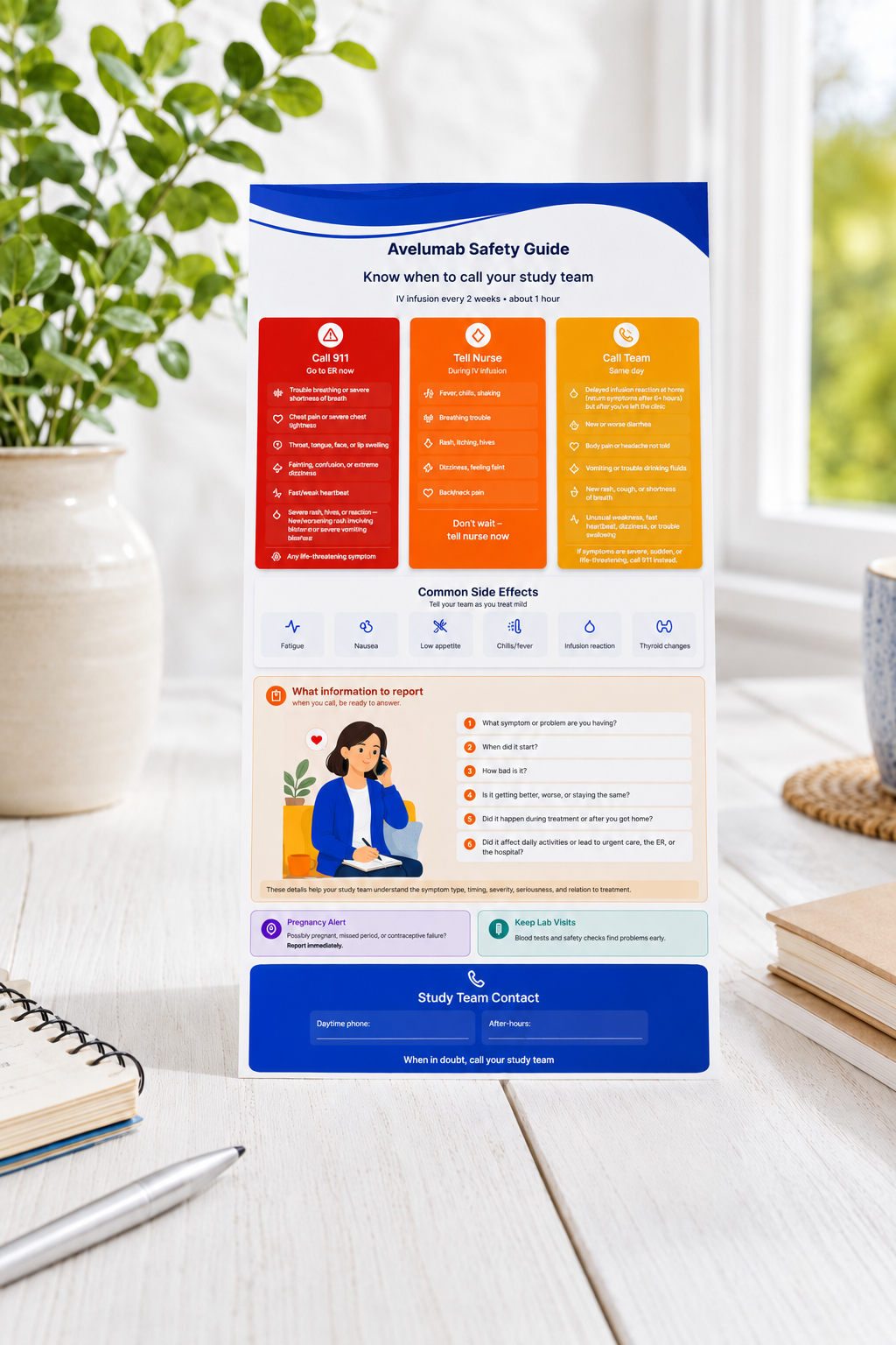
Safety Symptom & "When to Call" Guide
One-page visual guide
Translates protocol safety information into clear, action-oriented instructions so patients understand expected side effects, concerning symptoms, urgent red flags, when to call the study team, when to seek emergency care, and what details to report.
Supporting formats: Wallet card, portal/app screen, nurse follow-up script
Where it can be used: Patient handout, patient portal, study app, eConsent support, nursing education, follow-up call script.
UX value: Supports patient safety and adverse event reporting.
View 2 previews
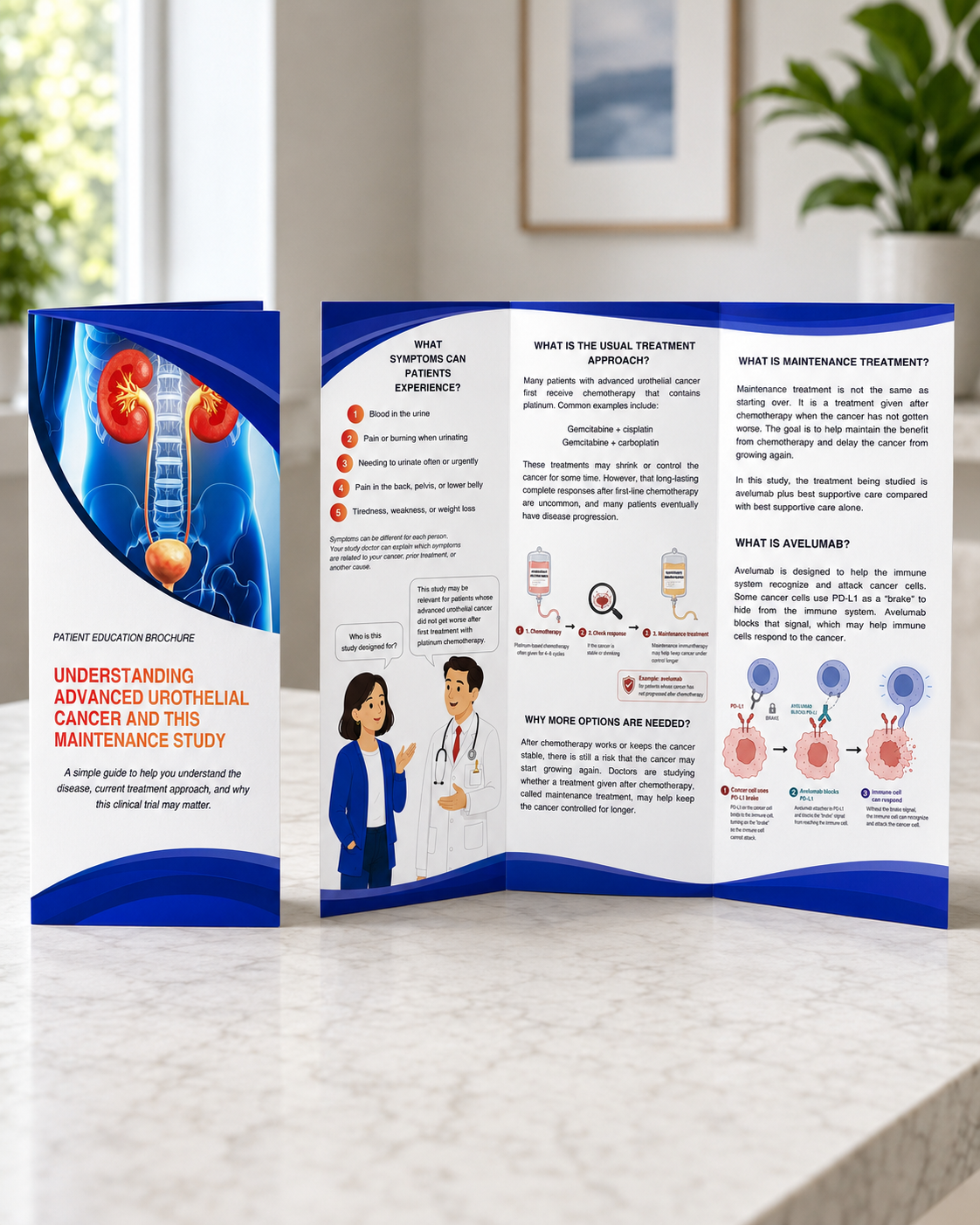
Patient-Friendly Medical & Disease Education
Brochure
Explains the disease and treatment context in plain language, including what urothelial cancer is, how it progresses, symptoms, treatment landscape, biomarkers, standard of care, unmet need, and why the clinical trial matters.
Supporting formats: Patient webpage, infographic, FAQ, educational slide
Where it can be used: Trial website, recruitment page, disease awareness campaign, patient brochure, advocacy group materials, patient portal.
UX value: Helps patients understand the medical context before deciding whether the study may be relevant to them.
View 3 previews
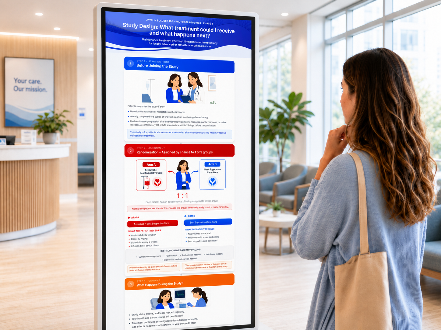
Treatment Arm / Study Design Visual Explanation
Flowchart / study design diagram
Visually explains treatment groups, randomization, standard of care, crossover if applicable, dose schedule, treatment duration, and follow-up. It answers: “What group could I be assigned to, what will I receive, and what happens next?”
Supporting formats: Comparison table, short animation
Where it can be used: Trial website, digital display, patient brochure, recruitment materials, consent discussion support, investigator meeting, sponsor presentation.
UX value: Reduces confusion around study design and treatment assignment.
View 2 previews
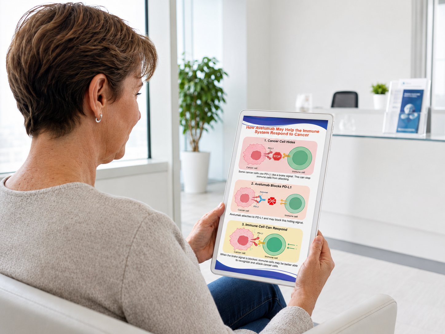
Mechanism-of-Action Visual Explanation
Medical diagram
Explains how avelumab may help the immune system recognize and respond to cancer cells. This deliverable includes two versions: a patient-friendly visual explanation and a more scientific expert version for professional audiences.
Supporting formats: Patient illustration, slide, animation
Where it can be used: Patient education page — paper or digital, medical affairs deck, investigator meeting, internal training, conference booth materials.
UX value: Makes abstract immunology easier to understand through step-by-step visual explanation.
View 4 previews
Medical Procedure Explanation Library
Modular procedure cards
Explains protocol-required procedures such as blood draws, CT/MRI scans, ECG, biopsies, infusions, genetic testing, pregnancy testing, questionnaires, and follow-up visits. Each card uses the same question-based structure: what it is, why it is needed, how to prepare, what the patient may feel, how long it takes, and what happens afterward.
Supporting formats: One-page handouts, visit-preparation checklist
Where it can be used: Patient portal, visit-preparation emails, eConsent support, site handouts, study app, patient brochure.
UX value: Creates a reusable content system that can scale across multiple trial procedures.
View 7 previews
Safety Symptom & "When to Call" Guide
This guide translates safety information into action-oriented patient instructions. It separates symptoms by urgency and helps patients understand when to seek emergency care, when to notify the nurse, when to call the study team, and what details to report.
Full one-page guide
Close-up of red/orange/yellow symptom zones
Close-up of "What information to report"
Patient holding the guide in a clinic setting
UX decisions
- Color-coded urgency levels
- Short action labels
- Symptom examples grouped by severity
- Contact section placed at the bottom
- Designed for print and digital use
Treatment Arm / Study Design Visual Explanation
This flowchart helps patients understand what group they could be assigned to, what each group receives, what happens during the study, and what may happen next.
Design note: This artifact belongs in Medical Content & Visual Communication because it is used to explain treatment options to patients visually. It is not presented as an operational protocol workflow or site execution map.
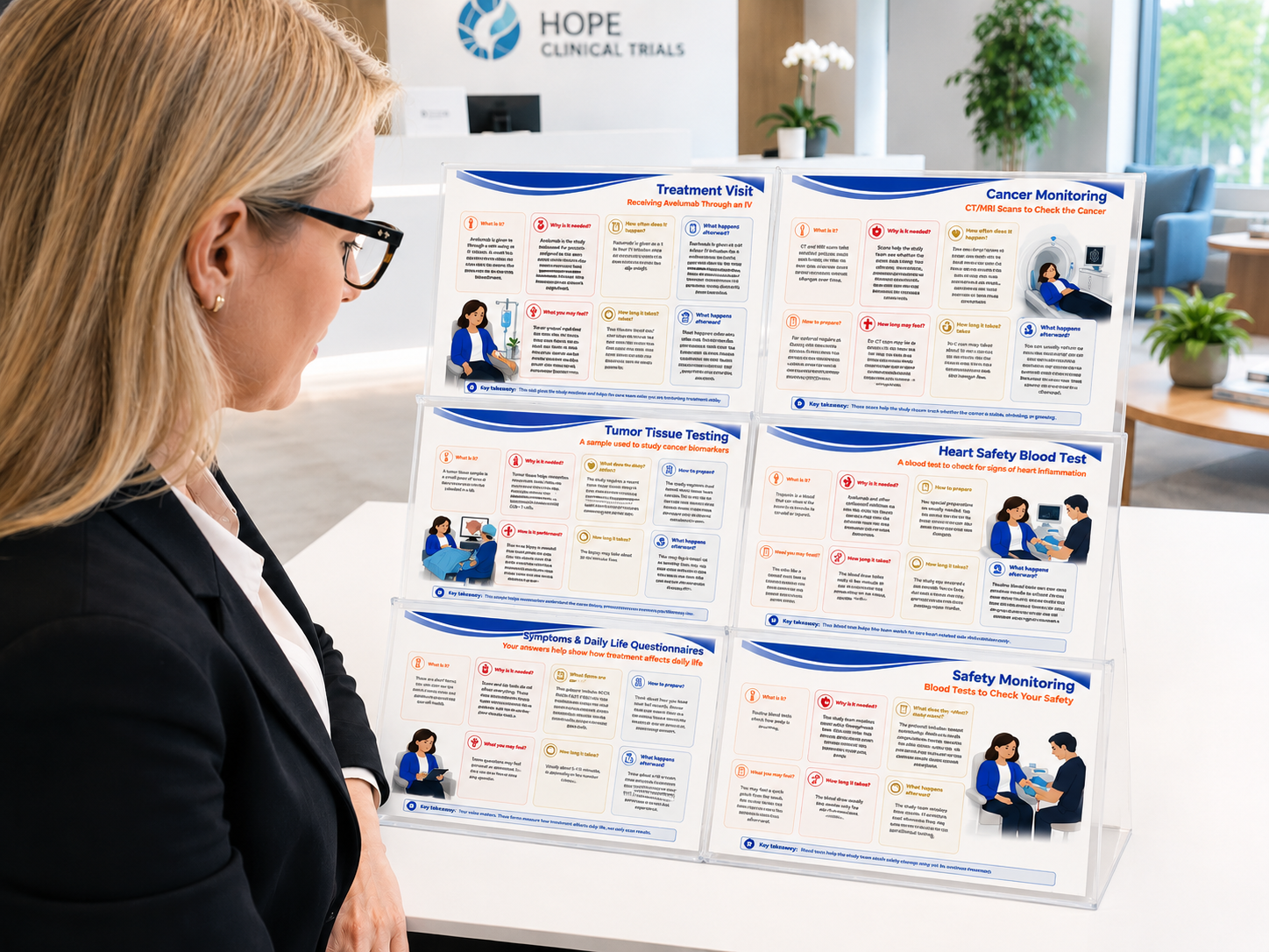
Medical Procedure Explanation Library
The procedure card system uses a consistent structure across different trial procedures so patients know where to find the information they need.
Treatment Visit: Receiving Avelumab Through an IV
- What is it?
- Why is it needed?
- How to prepare?
- What you may feel?
- How long it takes?
- What happens afterward?
Cancer Monitoring: CT/MRI Scans
- What is it?
- Why is it needed?
- How to prepare?
- What you may feel?
- How long it takes?
- What happens afterward?
Safety Monitoring: Blood Tests
- What is it?
- Why is it needed?
- How to prepare?
- What you may feel?
- How long it takes?
- What happens afterward?
Heart Safety Blood Test: Troponin
- What is it?
- Why is it needed?
- How to prepare?
- What you may feel?
- How long it takes?
- What happens afterward?
Tumor Tissue Testing
- What is it?
- Why is it needed?
- How to prepare?
- What you may feel?
- How long it takes?
- What happens afterward?
Symptoms & Daily Life Questionnaires
- What is it?
- Why is it needed?
- How to prepare?
- What you may feel?
- How long it takes?
- What happens afterward?
UX Principles Demonstrated
Plain-language medical writing
Technical terms were translated into patient-centered language.
Question-based structure
Information is organized around what patients naturally ask.
Visual hierarchy
Important information is broken into sections, icons, callouts, and cards.
Safety-first communication
Urgent symptoms and reporting instructions are easy to find.
Modular content system
Materials can stand alone or work together as a toolkit.
Multi-channel readiness
Content can be adapted for print, portal, app, brochure, and clinic use.
A patient-facing medical communication system
The final toolkit demonstrates how medical content strategy and visual communication can make complex oncology trial information easier to understand, easier to navigate, and easier to discuss with the study team.
Improves comprehension
Patients can better understand treatment options, procedures, and safety information.
Reduces uncertainty
Visual materials explain what may happen before, during, and after the study.
Supports multiple touchpoints
The toolkit can be used across brochures, portals, apps, clinic handouts, and patient discussions.
Case study by Christina — Clinical UX Design | Medical Content Strategy | Patient Education